
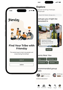
Friendship App "Friendzy"
Designed the user interface for a mobile app that enables adults to build authentic friendships by providing a safe, supportive environment for meaningful real-life connections.
Overview
Over a 6-week user interface design project, I created a mobile app to help adults overcome the challenges of making friends after university. Inspired by real experiences with social connection, the app emphasizes empathy, emotional safety, and fostering authentic, meaningful relationships for users seeking genuine companionship. Although the project was primarily UI-focused, I chose to incorporate user research into the process because I believed it was essential to move forward effectively.
The Challenge
Many adults struggle to form new friendships due to busy schedules, social anxiety, and a lack of safe spaces for authentic connection. While existing social apps mostly support dating, few prioritize building genuine friendships. The challenge was to design a mobile app that fosters an emotionally safe environment, encouraging vulnerability and facilitating real-life connections.
My Role: Sole UX/UI Designer
Research:
-
Designed and conducted a survey to uncover challenges that adults face with making new friends
-
Analyzed existing friendship apps to identify gaps and opportunities
Design:
-
Created wireframes to outline app structure and user flow
-
Developed moodboards to establish the app’s visual tone and emotional vibe
-
Selected a colour palette that conveys warmth, trust, and emotional safety
-
Designed interactive prototypes to demonstrate key features and user interactions
Usability Testing:
-
Facilitated usability testing sessions to collect feedback
-
Refined designs based on user insights to enhance usability
Design Process
-
Surveyed adults about their experiences making new friends and researched existing friendship apps
-
Analyzed data to create three main user flows and wireframe sketches
-
Developed mid-fidelity prototypes and conducted three user interviews to gather insights on app direction
-
Updated mid-fidelity prototype based on feedback then developed a high-fidelity prototype
-
Conducted unmoderated usability testing with five participants via Useberry
-
Analyzed heatmaps, click data, and Likert scale responses to assess task difficulty and identify further improvements
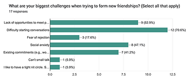
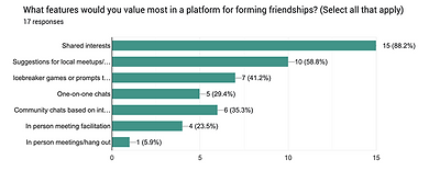
User Research
I conducted a survey with 17 participants to quickly gather insights into adults’ challenges with making new friends, focusing on their social habits, pain points, and preferences for app features. This
helped identify key areas to address in the app design.
Findings:
-
70% of participants have difficulty starting conversations
-
52% of participants lack of opportunities to meet people
-
47% of participants experience social anxiety
-
41% of participants have existing commitments (e.g. work, family, etc.)


Crazy 8s Workshop
After analyzing user research, I led a Crazy 8s workshop with three other classmates to quickly explore a range of ideas addressing key pain points. This rapid sketching exercise sparked diverse solutions for onboarding, friend matching, and reducing social anxiety.
User Flows
I designed three key user flows to define the app’s core experience: signing up, creating a profile, and navigating the homepage. These flows helped shape the overall structure and ensured that users could move through the app smoothly from first interaction to ongoing engagement.


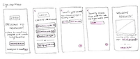

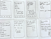
Sketches & Mid-Fidelity Prototype
Based on ideas from the ideation phase, I created low-fidelity wireframes to map key user flows and screen layouts. These evolved into a mid-fidelity prototype focused on structure and interaction without visual styling. To validate functionality early, I ran a usability test using the Rainbow Spreadsheet method to track feedback, spot patterns, and address usability issues. This process ensured a more intuitive foundation before moving into high-fidelity design.
Key Features
To ease users’ anxiety around meeting new people, I focused on features that encourage comfortable interactions.


Interest-based group events to encourage low-pressure socializing
Conversation starters to help break the ice and ease anxiety
Fun quizzes to match users based on shared interests
Detailed preferences to personalize matches and events
Visual Design & UI Decisions
I designed the app with a warm, inviting feel, avoiding typical dating app colours. Using a soft palette and friendly typography, I aimed to foster comfort and real connections. Accessibility was key—I ensured good colour contrast and readable fonts. A style guide and 8-point grid system maintained consistency and balanced layouts throughout. However, after learning more about UI design and accessibility, I realize some fonts were too small for mobile and could be improved.

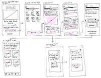
Usability Testing & Design Adjustments
I tested the high-fidelity prototype with 5 users in Useberry to collect valuable feedback on design, interactions, and overall experience. This testing helped uncover usability issues and guided final refinements to ensure the app was intuitive and user-friendly. Key design adjustments based on these findings are detailed below and continued on the next page.

Some participants clicked the centre of the screen to open the dropdown, but only the arrow was clickable. To improve usability, I made the entire button clickable and added a hover effect to clearly indicate interactivity.

During testing, I noticed some buttons had clickable areas that were too small—participants clicked correctly, but the app didn’t always respond. To fix this, I increased the button sizes for better usability.

Learnings
This was my first time using Figma, so I experienced a steep learning curve in a fast-paced project environment. As I was still getting comfortable with the tool, I now recognize some design oversights—such as overall font sizes being too small for mobile devices, which affected readability. This project taught me the importance of considering visibility and accessibility early in the design process, especially for smaller screens. Overall, it was a valuable experience that significantly improved my design skills and confidence with Figma.